


Get The Right Design For Your Printed Labels
By Ian Renton | Label Design Tips, Label Printing - General Knowledge, Uncategorized | 24 Jul 2018 |
Get The Right Design For Your Printed Labels
Ian Renton | 24/07/2018 | Label Design Tips,Label Printing - General Knowledge,Uncategorized
It is absolutely vital that you have the right design for your printed labels. To get the very best label design, I really only see two options. You could hire a competent graphic designer that understands how to present artwork for printed labels so the best result is reached.
Alternatively, you can submit your images, information and label sizes and our team of graphic designers will prepare your label artwork for you. If you have several variations of your labels, then you may find it less costly to use our team of designers. You can use our team of graphic designers at Renton's Labels to ensure your design is exactly right and ready to print. When speaking to our designers, they will also provide free advice on the best label materials and even the most economical way to print your labels.
Getting the right design for your printed labels is not as easy as you might think. There are several concepts to get right. If your printed labels are urgent, then you need the services of a skilled graphic designer who is familiar with the printing industry. Avoid graphic designers who specialise in web design as these designers can overlook the basic principles of print requirements. Our graphic designers will often spend a big chunk of their time fixing artwork that has been poorly prepared. In fact, your labels cannot go on the printing press until the design is right.
As a label printing company, we love to get print ready artwork as we like to print your labels quickly and get them shipped to you as often your order will be urgent. A common mistake made by graphic designers is to misunderstand the importance of bleed in label printing. Many labels are printed on white label stock and the colour printing will often go to the edge of the label. When the printed labels are die-cut or digitally cut, then if the cutting is out by only a fraction of a millimetre, then you will see a white mark on the edge of the labels. This is why it is important for the label artwork to bleed off the page, i.e. the artwork should be 3mm more around the entire edge of the label.
There is more to getting the right labels than just including bleed. In conducting research for this blog, I came across this American website from Container And Packaging. Reference: https://www.containerandpackaging.com/resources/prep-art-for-labels/
Seven Tips To Get The Best Label Designs
The following advice comes directly from the above link but it is worth reading the whole article.
- Vector images are often preferred to raster images when it comes to providing artwork for printed labels. Raster images such as digital photographs are made of thousands of tiny squares called pixels. According to the author of the web page referenced above, Vector images are mathematical calculations that form geometric shapes. When you zoom in, you will always see sharp crisp edges. The more vector your art, the better it will print." As you can see above, when zooming into or increasing the size of a raster image, the pixels become very noticeable and the edges of the letters become jagged. A similar effect occurs when printing from a raster image that is not high enough in resolution. Note that while a vector image can easily be converted to raster if needed, the reverse is much more difficult and often requires recreating the artwork from scratch.
- The best software to use is Adobe Illustrator or Adobe Indesign because both of these programs use the vector models as their defaults. These programs primarily produce .AI or .INDD files. Other vector-capable formats include .EPS, .SVG and .PDF files. An alternative program is Adobe Photoshop. Photoshop can handle vector artwork but is not ideal because the art is not saved as a vector file.
- Set up your label design correctly. Important images and text should be at least 2mm from the edge of the label. As mentioned above, the label artwork should extend beyond the page by about 3mm. This allows for possible movement in die cutting or digital cutting. If you've set your artwork up yourself, we have a handy guide on how to save Canva files for print, and in this we include a guide for adding bleed and crop marks.
- Prepare your colours for digital printing. Most but not all labels are printed digitally through a combination of four primary printing colours, i.e. Cyan (close to blue), Magenta (close to purple), Yellow and Black. The process is called CMYK printing. For digitally printed labels, the colours are percentages of these four colours. The drawback is that colours on digitally printed labels can vary according to the machine used, and the conditions under which the labels are printed. If your colours must match exactly and your print run is long enough then offset printing processes such as letterpress and flexographic printing are still available.
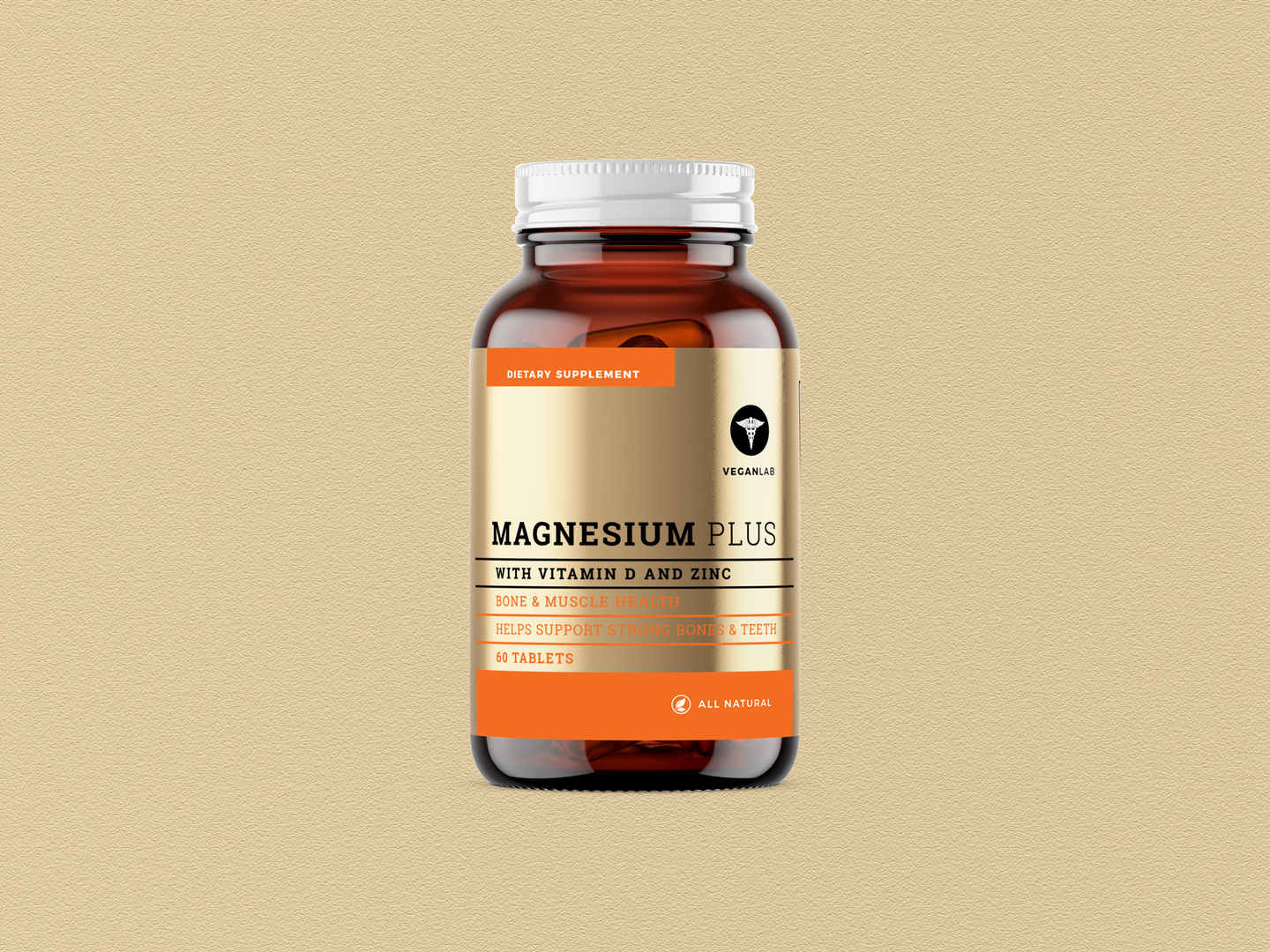
- You can add photos to your label design to increase the impact. As discussed in Point 1 above, photos are raster images and contain tiny squares which form pixels or dots. You need a high resolution file which requires at least 300 dots per square inch, i.e. 300 dpi to enable your labels to be printed in a good quality. This imaged is then placedinto your Indesign or Illustrator file.
- Choose appropriate fonts for your label design. Once you have your image, you can add logos or text. For your text, the absolute minimum font is four points. Choose a font that is quite thick. The bolder the better. Then, use a minimum number of words as space is limited. Any lines in your artwork should be at least one point in thickness.
- Prepare and save your file correctly. Firstly, convert fonts to outlines in case your label printer does not have the fonts you request. However, when you convert your fonts to outlines, it means you can no longer edit your text so you need to save the original copy before converting the file to outlines. The outlines file should be saved as a PDF file. The original file is saved in Illustrator (AI) or Indesign (ID).
The final step is to review your artwork. Look for typographical errors. Check product names, quantities and how your label looks at its actual size. Whilst it is good to employ a competent graphic design to get everything technical correct, never lose sight of the bigger picture. What you are really looking to do is to increase your sales by having better designs for printed labels.
Recent
-
Anti-Spike Drink Covers: Trusted By Police & Aussie Venues
-
A New Age of Luxurious, Cost-Effective Wine Labeling Solutions | Rentons Labels
30 Nov 2023 -
Waterproof Labels - Do you need them for your products? | Rentons Labels
3 Apr 2023 -
Custom labels with typography that wows
20 Mar 2023 -
Essential Tips for Crafting Your Own Beer Labels
6 Mar 2023 -
Maximalist Label Designs: Bold Trends in 2023
20 Feb 2023 -
5 things to note when designing honey labels
6 Feb 2023 -
Australian Custom Wine Label Requirements
30 Jan 2023 -
Premium Wine Labels vs Traditional Wine Labels: A Comprehensive Comparison
30 Jan 2023 -
Rentons' 2023 Predicted Label Trends
23 Jan 2023
Categories
- Bakery Labels
- Barcodes
- Blog
- Bottle Labels
- Candle Labels
- Charity Labels
- Chocolate Labels
- Christmas Labels
- Clear Labels
- Colours for Labels
- Cosmetic Labels
- Digital Label Printing
- Egg Labels
- Essential Oil Labels
- Event Labels
- Food Labels
- Freezer Labels
- General
- Hand Sanitiser Label
- Honey Labels
- Jam Labels
- Jar Labels
- Label Design Tips
- Label Material Types
- Label Printing - General Knowledge
- Label Printing - Miscellaneous
- Label Printing Processes
- Label Stocks
- Labelling Laws
- Lamination For Label Printing
- Machinery for Label Printing
- Marketing Labels
- Marketing Your Food Products
- Microwave Labels
- Olive Oil Labels
- Packaging Labels
- Prices of Printed Labels
- Product Labels
- Solutions
- Sub Category
- Trends in Label Printing
- Uncategorized
- Valentine's Day Labels
- Vinyl Labels
- Warning Labels
- Wedding Labels
- Wine Labels
Our Solutions
Contact Us

Rentons Labels is a Sydney based Label printing company who offer custom label printing solutions. They specialise in packaging labels, wine labels, and beverage labels and produce all their labels in Australia.
Suite 1, Unit 3,
2 Burrows Road South
St Peters NSW 2044
Australia
Phone:(02) 9160 4511
Email: info@rentonslabels.com.au
© COPYRIGHT 2021. ALL RIGHTS RESERVED.
ABN: 36 637 427 019 / +61 2 9160 4511 / PRIVACY POLICY