


Top Trends in Liquor Label Design for 2025
By Pranil Chandra | Label Printing - General Knowledge, General, Blog, Liquor label design trends, 2025 label trends, innovative liquor labels | 13 Feb 2025 |
Top Trends in Liquor Label Design for 2025
Pranil Chandra | 13/02/2025
When was the last time a liquor label caught your eye? Maybe it was a whisky bottle with a stunning gold-foil finish that screamed luxury, or a gin bottle with minimalist artistry that whispered sophistication. In 2025, liquor label design isn’t just about looks-it’s a powerful tool for storytelling, sustainability, and customer engagement.
Whether you’re a brand owner looking to stand out on crowded shelves or a design enthusiast seeking inspiration, understanding the latest trends in liquor label design can make all the difference in your product's success. In this article, we’ll dive into the coolest liquor label trends for 2025, showcase some show-stopping designs, and share tips on how to create labels that truly shine.
What are the 2025 Top Liquor Label Design Trends?
In 2025, liquor labels are evolving from decorative pieces to powerful, strategic tools that tell a brand’s story, promote sustainability, and enhance shelf appeal. From bold typography to interactive designs, these trends are setting brands apart in an increasingly competitive market.
So, what’s next for liquor label design? Let’s take a closer look at the game-changing innovations that are shaping labels in 2025.

Art and aesthetics are taking centre stage in 2025. Brands are experimenting with unique designs that convey personality and grab attention from a distance. Whether it’s beautiful watecolour artwork or hand-drawn typography on liquor labels, more and more, people are happy to pay a little extra for something that feels special. Whether it’s the craftsmanship, the rich flavours, or the story behind the brand.
Example:
This bottle perfectly captures the essence of the artistic design trend. The transparent bottle lets the watercolour artwork shine through, creating a seamless connection between the product and its packaging. Paired with clean, minimalist typography, the design balances artistry and simplicity, giving it a premium, modern feel.
How to Tap into this Trend:
- Incorporate Handcrafted Elements: Use hand-drawn illustrations, brushstrokes, or watercolour effects to give your label a personal, artistic touch.
- Play with Colours: Experiment with vibrant, unexpected palettes or soft, layered hues to evoke emotion and grab attention.
- Connect Art to Your Story: Ensure the artwork reflects your brand’s identity, whether it’s the landscape where ingredients are sourced or the mood your product inspires.
- Experiment with Shapes and Layouts: Break free from traditional label designs by using asymmetrical, abstract patterns, or wrap-around graphics for a bold, modern look.
- Use the Bottle as a Canvas: Extend the design beyond the label, incorporating etched or printed art directly onto the glass for a seamless, premium feel.

Moving forward liquor labels are doing more than catching the eye-they’re telling meaningful stories. Customers are drawn to brands that share their journey, values, or inspiration, making the label a gateway into the brand’s world. It’s about more than just a drink; it’s about creating a connection.
Example:
One great example is The Collective Spirits Co., a gin brand built around the idea of fostering community and celebrating long-distance friendships. Founded by four international rugby friends, each flavour reflects the unique botanicals from the places each friend calls home. The label tells this heartfelt story through sophisticated packaging and rich colours that mirror the vast landscapes behind the flavours. The rose gold accents add an elegant touch, reinforcing the brand’s premium feel.
How to Tap into this Trend:
- Share the story of your product’s origins or the inspiration behind it directly on the label.
- Use design elements - like colours, textures, or illustrations - that bring the narrative to life.
- Add a personal touch, such as a signature, a quote, or a map, to make the story more relatable.
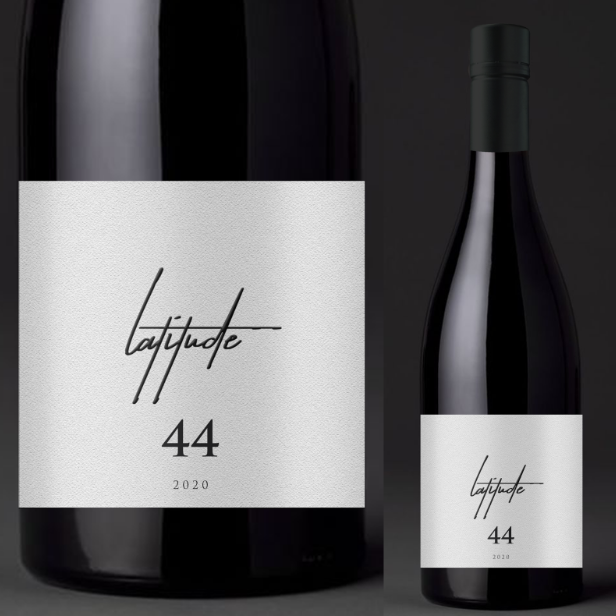
The "less is more" approach still reigns, but it’s now about incorporating a creative twist that makes a statement. Minimalist designs, with a standout feature such as a bold colour block, unique illustration, or asymmetrical layout, allow a brand to appear sophisticated while leaving a lasting impression.
Example:
Latitude nails the minimalist look with their sleek white matte finish and simple black line logo. It’s clean, modern, and impossible to overlook. The whitespace adds just the right amount of intrigue, drawing you in without feeling too busy. Plus, that script font - “Latitude” - is chic, subtle and a nod to the brand’s identity, sparking curiosity and making a lasting impact.
How to Tap into this Trend:
- Stick to a Clean Palette: Choose a few core colours, like black, white, or metallics, to create a sleek and timeless look.
- Add an Eye-Catching Feature: Include something unique, like texture, to keep the design interesting.
- Prioritise Typography: Use minimal text but make it count. Choose fonts that are modern and fit your brand's identity.
- Use High-Quality Materials: Matte finishes, embossed details, or metallic accents can elevate a simple design and make it feel premium.
- Focus on one key design element and use negative space to your advantage.

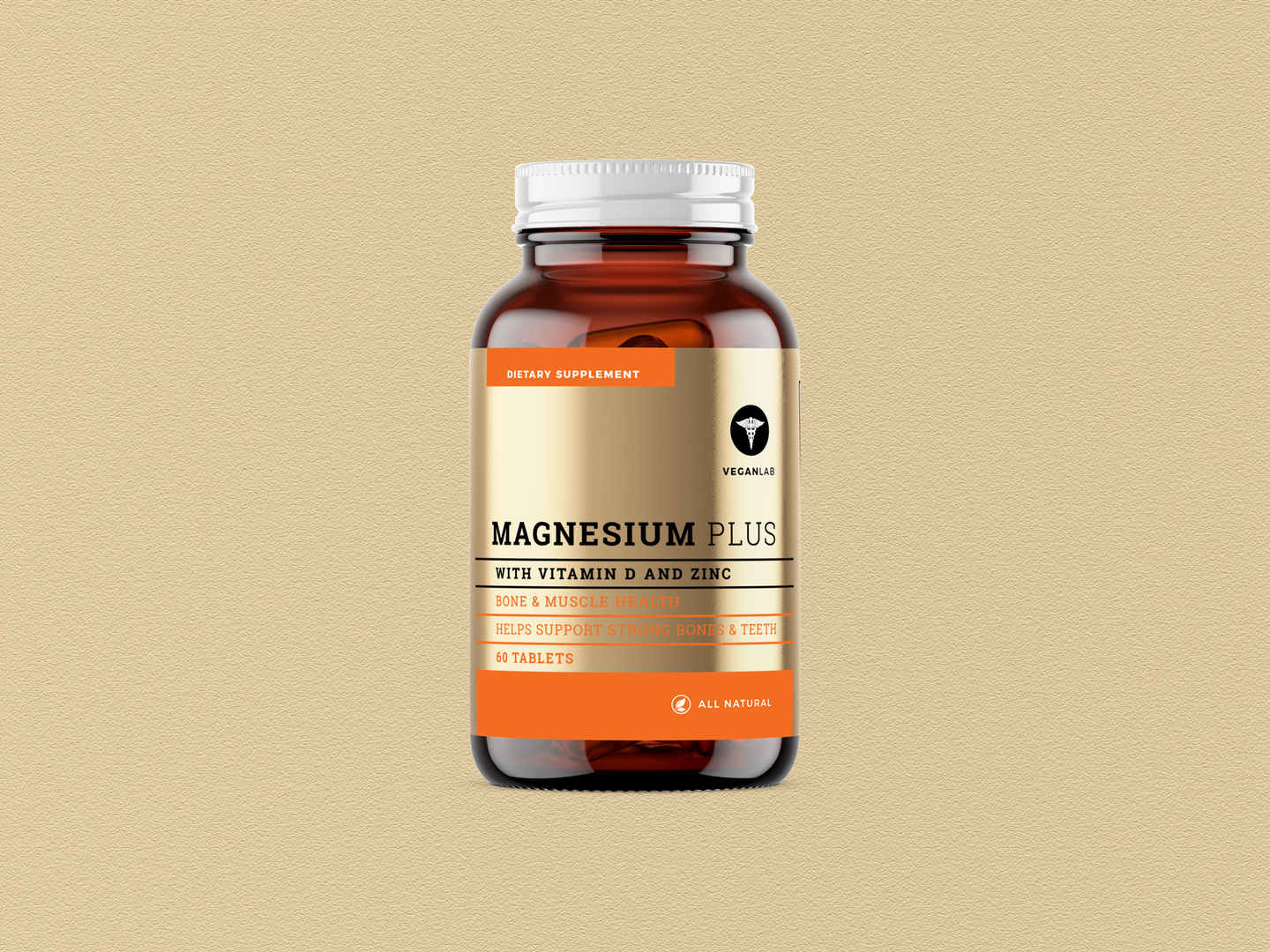
Labels are no longer just visual; they’re tactile. Raised embossing, foil stamping, or even textured paper can create a sensory experience that makes a bottle more memorable to touch and hold.
Example:
One premium brand uses metallic lettering embossed on its label and a striking gold foil finish to create a luxurious, high-end aesthetic. This combination of textures evokes sophistication, turning the label into an experience the customer can feel.
How to Tap into this Trend:
- Use Embossing or Debossing: Raised or indented lettering and designs add a touch of sophistication and make your label feel premium in the customer’s hands.
- Incorporate Foil Accents: Metallic foils, especially gold or silver, can highlight key elements like your logo or product name, catching the light for a luxurious effect.
- Experiment with Material Choices: Opt for textured paper, velvet finishes, or even wood or leather elements to create a unique look and feel.
- Highlight Key Design Features: Use textures to draw attention to specific parts of your label, like the name, tagline, or signature design element.
- Match the Texture: Choose textures that align with your brand image. Embossing and foiling work is best for high-end spirits, while rough, rustic textures can suit craft or artisanal products.
Make your Liquor Label Stand Out in 2025
Liquor label design is more than packaging. It’s a brand’s first handshake with its customers. If your label doesn’t grab attention, communicate your story, and exude quality, your product risks being overlooked on crowded shelves. The right liquor label can communicate your product’s story, quality, and uniqueness in seconds.
At Rentons Labels, we don’t just create beautiful labels-we craft designs that truly tell your brand’s story. We’re at the forefront of the 2025 label trends, blending creativity and functionality to help your product stand out.
With our expertise, your label will do more than catch the eye-it will forge a connection with your customers. Let’s work together to design something innovative, memorable, and impossible to ignore.
So, what’s your next move? Start by thinking about your brand’s story and how it aligns with these trends. Then, work with a designer who can bring your vision to life in a way that’s both innovative and unforgettable.
Contact Rentons Labels today to print labels that tell your story, captures attention, and sets your brand apart in 2025.
Pranil Chandra | 13/02/2025 | Label Printing - General Knowledge,General,Blog,Liquor label design trends,2025 label trends,innovative liquor labels
Recent
-
Rentons Premium Custom Liquor Labels: Are They Right for Your Product?
7 Aug 2025 -
Comparing Rentons Labels Anti-Spike Drink Covers vs. Traditional Safety Measures
29 Jul 2025 -
Common Spirit Labels Problems and How to Solve Them
11 Jul 2025 -
Why Drink Covers Are the New Drink Coasters for Alcohol, Liquor & Spirit Brands: Enhancing Safety and Branding
19 May 2025 -
Top Trends in Liquor Label Design for 2025
13 Feb 2025 -
The Role of Personalisation in Wine Label Design
13 Feb 2025 -
Top Trends in Wine Label Design for 2025 - Rentons Labels
13 Feb 2025 -
Rentons Anti-Spike Drink Covers vs. Other Alcohol Promotional Merchandise
13 Jan 2025 -
The Benefits of Using Rentons’ Premium Wine Labels for Your Brand
18 Dec 2024 -
How You Can Achieves Affordable Luxury with Multi-Coloured Foil?
6 Dec 2024
Categories
- 2025 label trends
- Alcohol Labelling Issues
- Anti-Spike Solutions
- Bakery Labels
- Barcodes
- Blog
- Bottle Labels
- Candle Labels
- Charity Labels
- Chocolate Labels
- Christmas Labels
- Clear Labels
- Colours for Labels
- Cosmetic Labels
- Digital Label Printing
- Egg Labels
- Essential Oil Labels
- Event Labels
- Food Labels
- Freezer Labels
- General
- Hand Sanitiser Label
- Honey Labels
- Jam Labels
- Jar Labels
- Label Design Tips
- Label Material Types
- Label Printing - General Knowledge
- Label Printing - Miscellaneous
- Label Printing Processes
- Label Stocks
- Labelling Laws
- Lamination For Label Printing
- Liquor Label Challenges
- Liquor label design trends
- Machinery for Label Printing
- Marketing Labels
- Marketing Your Food Products
- Microwave Labels
- Olive Oil Labels
- Packaging Labels
- Personalised wine labels
- Prices of Printed Labels
- Product Labels
- Spirit Label Problems
- Trends in Label Printing
- Uncategorized
- Valentine's Day Labels
- Vinyl Labels
- Warning Labels
- Wedding Labels
- Wine Labels
- custom wine labels
- innovative liquor labels
- unique wine labels

Rentons Labels is a Sydney based Label printing company who offer custom label printing solutions. They specialise in packaging labels, wine labels, and beverage labels and produce all their labels in Australia.
Suite 1, Unit 3, 2 Burrows Road South
St Peters NSW 2044 Australia
Phone: (02) 9160 4511
Email: info@rentonslabels.com.au
Our Solutions
Helpful Links